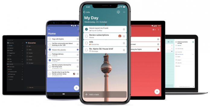
“We polished the design of To Do by reducing the header size and adding in more color to give the app warmth and personalization. It’s still the simple and elegant app you love, but now with more options to customize, so you can tailor it to suit yourself and your lists. With the new version of To Do, you can choose from a wide range of backgrounds, including the beloved Berlin TV tower that was a feature in Wunderlist. In addition, you can choose a different background for every list”, says Marcel Käding, Program Manager at Microsoft for Microsoft To Do and Wunderlist. The road to migrating Wunderlist features to Microsoft To-Do has been a slow one. Microsoft acquired Wunderlist in 2015 for up to $200 million. While the service was among the most popular task managers with 13 million users, Microsoft had different plans for Wunderlist.
New Era
Rather than porting Wunderlist to Azure, Redmond opted for a ground up new app. Over the years, rumors persisted that transitioning Wunderlist feature to Microsoft To-Do was a hassle. However, in recent years To-Do has become an excellent service. Microsoft has supported the app with regular updates and interesting features. Unfortunately, To-Do’s growth has left little room for Wunderlist. While the app is still working, Microsoft announced in 2017 it will eventually be shuttered. Interestingly, To-Do’s new design comes at the same time Wunderlist founder Christian Reber has offered to buy back the app. Reber says he wants to keep the Wunderlist name alive and says his offer is “serious”. “Still sad Microsoft wants to shut down Wunderlist, even though people still love and use it,” says Reber on Twitter. “I’m serious Satya Nadella and Marcus Ash, please let me buy it back. Keep the team and focus on Microsoft To-Do, and no one will be angry for not shutting down Wunderlist.”


